01
Direction
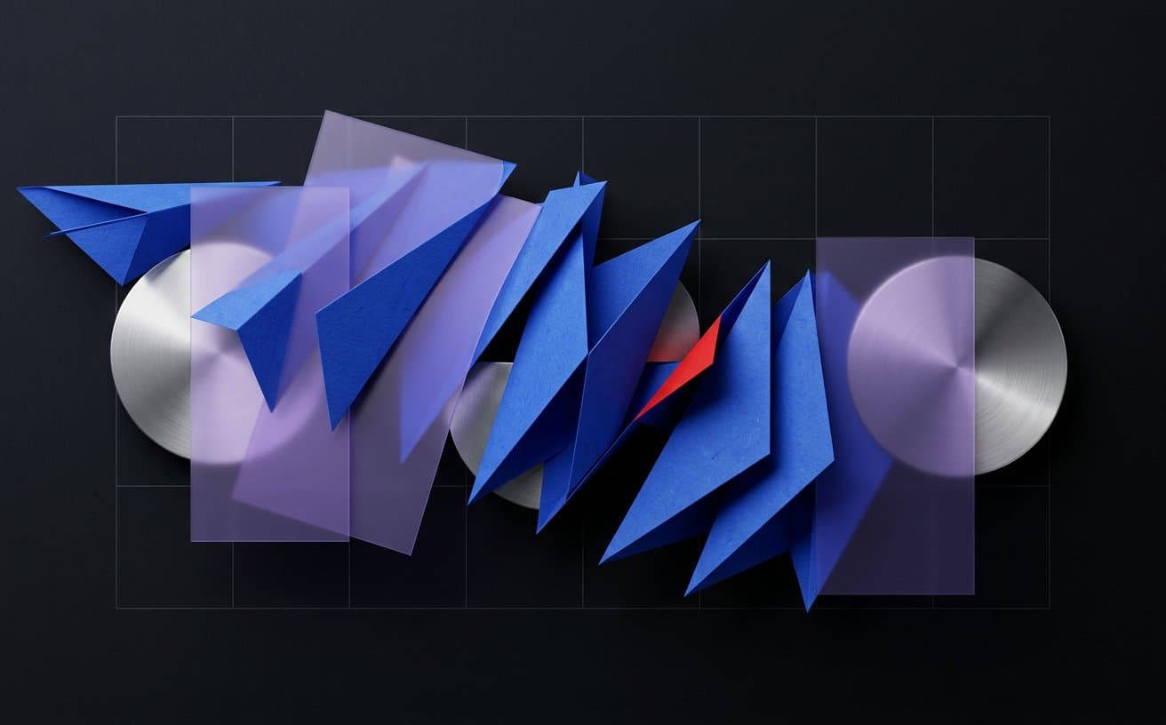
Tactile paper and chrome add contrast to a precise digital grid. Compositions feel energetic, but recurring scale relationships and colour roles keep the system controlled.
04 / Brand & Campaign
A graphic system built to remain recognisable while composition, pace, and format continue to change.
 Self-initiated direction study
Creative premise
The concept uses a small kit of parts—angled planes, circular anchors, translucent fields, and one red marker—to create variety inside a repeatable identity.
From question to direction
Tactile paper and chrome add contrast to a precise digital grid. Compositions feel energetic, but recurring scale relationships and colour roles keep the system controlled.
Each format starts from the same anchor-and-flow rule. The anchor holds recognition; the directional planes adapt to horizontal, vertical, static, and motion-led placements.
In motion, shapes would arrive in short rhythmic phrases rather than continuous activity. The result is designed to create distinct moments for message, image, and action.
Frame study
These crops examine composition and material within the same original concept artwork; they are not separate delivered assets.
What this concept explores
A compact visual kit with room for variation
Hierarchy that survives horizontal and vertical formats
Motion principles derived from the graphic identity
Campaign consistency without template repetition
Connected craft
Build an original direction
Share the audience, context, and rough idea. We will identify the right mix of story, design, motion, and technology from there.